Choosing the right color combinations can instantly elevate any outfit, making it look polished and intentional. Some of the best color combinations include classic pairs like navy and white, black and red, or complementary colors such as blue and orange. These combinations work because they balance contrast and harmony, enhancing your overall appearance without overwhelming.
Understanding color theory is helpful, but not necessary, to make great outfit choices. Using simple, proven combos allows you to mix and match easily while maintaining style consistency. This guide highlights effective color pairs that suit various occasions and personal tastes.
Understanding Color Theory for Fashion
Color theory provides a practical framework for combining colors effectively in outfits. It explains relationships between colors, their emotional impact, and how they influence perception. Knowing how to balance warm and cool tones and select harmonious combinations enhances styling precision.
The Color Wheel Basics
The color wheel is a circular diagram representing colors arranged by their chromatic relationship. It consists of primary colors (red, blue, yellow), secondary colors (green, orange, purple), and tertiary colors, which are blends of primary and secondary hues.
Understanding the wheel helps identify which colors naturally contrast or complement each other. For example, colors opposite each other on the wheel—like blue and orange—create strong visual contrast. Adjacent colors such as blue and green blend more smoothly, producing subtle outfit combinations.
Color Harmonies: Complementary, Analogous, and Triadic
Complementary colors sit opposite each other on the color wheel, creating high contrast and vibrant looks when paired. Examples include red and green or blue and orange. Use these for bold, attention-grabbing outfits.
Analogous colors are next to each other on the wheel, like blue, blue-green, and green. These create harmonious, calming combinations suitable for understated, elegant styles.
Triadic harmony involves three colors evenly spaced around the wheel, such as red, yellow, and blue. This offers balanced, dynamic combinations that maintain vibrancy without overwhelming the eye.
Warm vs. Cool Tones in Styling
Warm tones include reds, oranges, and yellows, conveying energy and warmth. These colors often create a lively, approachable appearance. Warm tones work well for casual and festive outfits.
Cool tones span blues, greens, and purples, providing calmness and sophistication. They suit professional and formal attire, giving a composed and polished effect.
Combining warm and cool tones in moderation can add balance to an outfit. Use one as the dominant color and the other as an accent to avoid a clash and maintain coherence.
Classic Color Combinations for Outfits
Certain color combinations have stood the test of time because they offer balance, versatility, and sophistication. These pairings work well across different occasions and styles, making them reliable choices for any wardrobe. Attention to contrast, tone, and context is essential for achieving the best results with these combinations.
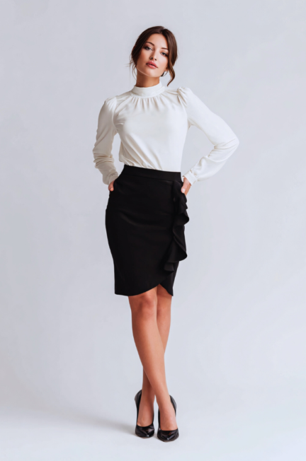
Black and White Pairings
Black and white create a stark contrast that is both timeless and striking. This combination suits formal settings and casual looks equally well, providing a clean and polished appearance. Using clean lines and simple cuts maximizes the impact.
Incorporate black pants or skirts with white blouses for office wear. For casual outfits, white tees paired with black jeans offer effortless style. Adding accessories like black belts or white sneakers further enhances the balance.
Patterns such as stripes or checks appear classic in black and white, adding visual interest without overwhelming the simplicity. The key is maintaining a clear distinction between the two colors to keep the look crisp.
Navy and Beige Outfits
Navy and beige together offer a softer alternative to black and white with equally strong appeal. Navy brings depth; beige adds warmth and lightness. This combination works well for business casual and smart weekend wear.
Pair navy blazers with beige trousers for refined layering. Beige sweaters or tops smooth out the navy’s intensity and create easy transitions between seasons. The contrast is moderate, so textures like knits or linens add dimension.
This pairing is effective in both monochromatic outfits and as a base for brighter accent colors. Navy and beige provide a neutral canvas that enhances rather than competes with other elements.
Neutral Palettes and Monochrome Looks
Neutral palettes use shades like gray, cream, taupe, and brown to craft sophisticated, low-contrast outfits. These colors blend softly, creating a harmonious visual effect without strong color clashes.
Monochrome looks stick to variations of a single hue for depth and cohesion. For example, layering light gray, charcoal, and slate creates a sleek, modern outfit. Texture becomes crucial to prevent monotony in such cases.
Neutrals pair well with any skin tone and occasion, offering flexibility. Combining neutrals with structured or minimalist designs focuses attention on silhouette and fabric quality rather than color intensity.
Bold and Vibrant Outfit Color Pairings
Using vivid colors together creates striking and energetic looks. Combining bold hues requires attention to balance and contrast to avoid clashing. Techniques like pairing primary colors, playing with contrasts, and applying color blocking can guide strong outfit choices.
Primary Colors Together
Primary colors—red, blue, and yellow—form the base of most color systems and create visually powerful pairings. Wearing red and blue, for example, generates a classic, attention-grabbing effect. Incorporating yellow adds brightness and liveliness without complexity.
When mixing these colors, opt for clean, solid pieces to prevent visual confusion. For example, a red jacket with a blue skirt and subtle yellow accessories can balance the intensity while maintaining vibrancy. Keep patterns minimal since the colors alone make a bold impact.
Primary color combinations work well for both casual and professional settings when styled carefully. They express confidence and energy through simplicity and clarity.
Contrasting Bright Colors
Outfits using contrasting bright colors, like orange with green or pink with turquoise, create dynamic and playful looks. These colors sit across from each other on the color wheel, naturally drawing the eye.
To pull off contrasts, pick one dominant color and use the other as an accent. For instance, a bright orange top paired with green shoes or a handbag can be striking without overpowering. Integrate neutrals such as white or black to soften strong contrasts.
Contrast pairing allows for creative expression but requires mindful proportioning. Wearing too many competing bright elements at once can overwhelm the outfit’s harmony.
Color Blocking Technique
Color blocking involves using large blocks of contrasting or complementary colors in one outfit. It highlights bold shapes and clean lines through well-defined color zones on garments.
Choose colors that contrast well but don’t clash—like purple and yellow or cobalt blue and orange. Keep accessories neutral or match one of the color blocks to maintain cohesion. Simple silhouettes work best to showcase this technique clearly.
Color blocking is ideal for making a fashion statement without complicated patterns. It delivers structured, modern aesthetics using plain, impactful colors.
Seasonal Color Combinations
Seasonal color choices reflect natural shifts in lighting and mood. Bright, light tones dominate warmer months, while deeper, richer hues suit colder seasons.
Spring and Summer Outfits
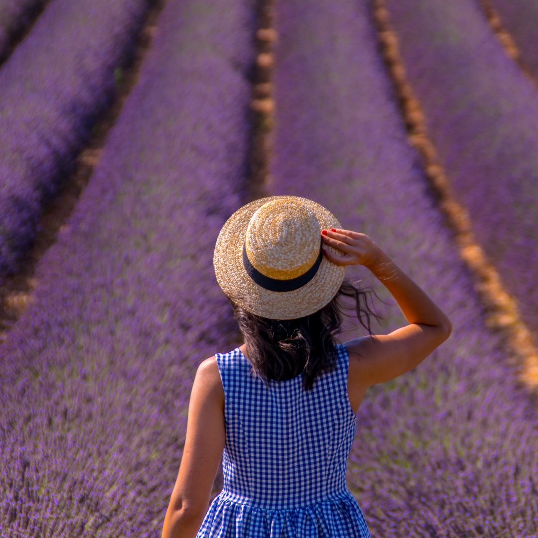
Spring and summer favor fresh, vibrant colors inspired by blooming nature and sunny days. Pastels like soft pink, mint green, and baby blue create light, airy looks. These pair well with neutrals such as white, beige, and light gray for balanced outfits.
For summer, bold brights like coral, turquoise, and lemon yellow work well, especially in casual or beachwear. Combining these with denim or white fabrics enhances the crisp feel. Avoid overly dark colors, as they absorb heat and feel heavy in warm weather.
Patterns like florals and stripes also complement these color choices. Layering lighter fabrics in matching or analogous colors maintains comfort and visual interest.
Fall and Winter Color Pairings
Fall and winter palettes shift toward warm, muted tones and jewel colors. Think olive green, mustard yellow, burgundy, and burnt orange for fall. These colors coordinate well with brown, tan, and dark denim, creating cozy and grounded looks.
Winter favors deeper blacks, navy, charcoal gray, and rich jewel tones like emerald or ruby. These shades make for sophisticated and versatile outfits. Layering wool, leather, and heavier fabrics enhances texture alongside color depth.
Classic color pairs for colder months include:
- Navy and camel
- Burgundy and charcoal
- Forest green and mustard
These combinations balance warmth with style while fitting the season’s low light and colder temperatures.
Matching Colors for Different Occasions
Selecting the right color combinations depends on the setting and purpose of the outfit. Patterns, contrasts, and tones should complement the environment while maintaining appropriateness and style.
Business and Professional Settings
In professional environments, neutral and muted colors work best. Shades like navy, gray, black, and white form a reliable foundation. These colors convey seriousness and can be easily paired with subtle accents such as burgundy, olive, or soft blues.
Avoid overly bright or clashing colors, as they can distract or appear unprofessional. For example, a navy suit paired with a light blue shirt and a charcoal tie is classic. Accessories should be minimal and complement the outfit’s palette.
Patterns like thin stripes or small checks can add interest without overwhelming the overall look. Consistency in tone helps maintain a balanced and polished appearance suitable for meetings, presentations, or office work.
Casual Outings
Casual settings allow for more freedom in color choices, mixing and matching bold and soft tones. Earth tones such as beige, olive, and burnt orange pair well with denim and simple textiles. Bright colors like reds, yellows, and even pastel shades fit depending on location and season.
Layering different shades of the same color can create depth without clashing. For instance, a light gray t-shirt with a charcoal jacket and navy jeans works well. Color blocking with complementary colors like blue and orange can add visual interest.
Patterns and textures also play a bigger role here; feel free to try floral, plaids, or graphic elements. The key is to balance vibrancy with harmony, keeping the outfit relaxed but visually pleasing.
Evening and Formal Events
Darker and richer colors dominate formal occasions. Black, deep navy, emerald green, burgundy, and metallics such as gold and silver are ideal. These shades convey elegance and sophistication.
Monochromatic schemes with subtle variation in texture provide refinement without overwhelming the senses. For example, a velvet burgundy blazer paired with black pants and a crisp white shirt highlights contrast and class.
Accessories like ties, pocket squares, or statement jewelry should enhance the outfit’s core colors. Avoid casual tones or mismatched hues that disrupt the overall formal tone. Maintaining color cohesion is crucial for a polished, event-appropriate look.
Choosing Colors According to Skin Tone
Selecting colors that complement your skin tone can enhance your appearance and make your outfits stand out naturally. The right shades work by harmonizing with your natural hues, creating balance and vibrancy.
Best Colors for Warm Undertones
People with warm undertones usually have a golden, peachy, or yellow base to their skin. Colors that reflect warmth work best, such as earth tones like burnt orange, mustard yellow, and olive green. These colors bring out the golden hints in the skin without clashing.
Rich shades of red, like tomato red or coral, also complement warm undertones, adding brightness without overwhelming. Metallics like gold and bronze enhance the natural warmth, creating subtle glow effects.
Avoid cool colors such as icy blues or purples, as they can make the skin look dull or washed out. Instead, stick to colors that evoke warmth and richness to create natural contrast.
Flattering Shades for Cool Undertones
Cool undertones typically have hints of blue, pink, or red beneath the skin. Colors with blue or purple bases enhance this undertone, such as jewel tones like sapphire, emerald, and amethyst.
Soft pastels with cool bases like lavender, mint, or rose pink also work well, creating gentle contrast without overpowering the natural skin shade. Silver, platinum, or pewter jewelry and accents complement cool undertones more effectively than gold.
Avoid overly warm colors such as orange or tomato red, which can clash with cool undertones and create disharmony. Instead, focus on shades with crisp, cool qualities to boost your skin’s natural undertone.
Accessorizing with Complementary Colors
Using complementary colors in accessories can elevate your outfit by adding contrast and visual interest. Complementary colors sit opposite each other on the color wheel, such as blue and orange or red and green. These pairings naturally draw attention and can enhance your overall look without overwhelming it.
When choosing accessories like bags, shoes, or jewelry, consider a color that contrasts with your main outfit color. For example, if you wear a navy dress, a bright orange handbag can create a bold but balanced effect. This method works well for adding pops of color to neutral or monochromatic clothing.
| Outfit Color | Suggested Complementary Accessory Color |
| Blue | Orange |
| Red | Green |
| Yellow | Purple |
| Green | Red |
Start small with complementary accessories—think belts, scarves, or statement earrings. These pieces offer a way to experiment with color contrasts without committing to a full complementary outfit.
Remember that texture and material also influence how accessories stand out. A matte accessory in a complementary color can be subtle, while a shiny or metallic one may appear more striking.
Balancing complementary accessories keeps your outfit coherent. Avoid using too many colors at once; one well-placed accessory is often enough for a sharp look.
Common Mistakes to Avoid in Outfit Color Pairing
One frequent mistake is overloading an outfit with too many colors. Sticking to two or three colors ensures balance and cohesion. Excessive color variety can create visual chaos and reduce the overall appeal.
Another error is ignoring skin tone compatibility. Colors that clash with your natural complexion may wash you out or look harsh. It’s important to test colors under natural light before committing.
Avoid pairing colors that are too close in shade but different in hue, such as two similar tones of green that don’t quite match. This can appear mismatched rather than coordinated.
Relying solely on trends instead of personal style often leads to outfits that feel forced. Choose color combinations that suit you, not just what is popular.
Some common pitfalls:
| Mistake | Explanation |
| Clashing Bright Colors | Can overwhelm the eye |
| Too Many Patterns with Color | Creates confusion and clutter |
| Disregarding Occasion | Color choices should fit the setting |
Remember that contrast is important but must be used thoughtfully. High contrast can be striking but may not work in all contexts. Low contrast can look subtle, but risks appearing dull if not balanced well.
Tips for Creating a Balanced Look
Start by choosing one dominant color for your outfit. This color should cover most of your clothing pieces. Then, add one or two accent colors to complement or contrast the base.
Neutral colors like black, white, gray, and beige work well to balance bolder shades. They offer a solid foundation without overwhelming your look.
Use the 60-30-10 rule to distribute colors effectively:
| Percentage | Role | Example |
| 60% | Dominant | Main garment (e.g., dress) |
| 30% | Secondary | Jacket, pants, or skirt |
| 10% | Accent | Accessories or shoes |
Mix warm and cool tones carefully. For instance, pairing a warm red with a cool blue creates contrast but can feel balanced if the colors have similar saturation or brightness.
Avoid combining too many vivid colors in one outfit. Stick to a limited palette to keep the look cohesive.
Texture can also influence balance. Mixing smooth and rough fabrics in the same color family adds depth without clashing.
Finally, check the overall look in different lights. Colors might appear slightly different indoors and outdoors, so adjusting tones is helpful.
Experimenting and Finding Your Signature Color Combinations
Finding your signature color combinations begins with exploration. Try pairing classic neutrals like black, white, or gray with bold accent shades such as red or teal. Observe how these colors interact and how they make you feel.
Keep a simple color palette in mind. Use this table as a starting guide:
| Base Color | Accent Colors | Effect |
| Navy Blue | Mustard Yellow, White | Sophisticated & Warm |
| Charcoal | Burgundy, Blush Pink | Modern & Elegant |
| Olive Green | Rust, Cream | Earthy & Balanced |
| Black | Red, Electric Blue | Bold & Classic |
Start small with accessories before committing to larger clothing items. For example, scarves, belts, or shoes might reveal which combinations suit your taste.
Remember your personal style and skin tone when experimenting. Some colors will highlight your features better than others. Keep notes or photos of outfits you like.
Mix fabrics and textures within your color choices to add depth. Matte with glossy or soft with structured materials can make an outfit more interesting without adding more colors.
Consistency is key. Once you find combinations that feel right, incorporate them regularly to create a distinct look. This helps develop a wardrobe that is cohesive and easy to style.